Horizon: a complete brand identity, built from a gradient square
Horizon’s logo, colour and type system, voice and 11-page brand book for a self-hosted tool that remembers why code is the way it is. Case study.
Is this you? A founder with a good product and nothing that makes it look like one.
By MarkPublished 17 October 2026
PeriodFrom 6 October 2026
IndustryDeveloper tools
FocusBrand identity
Hours10 to 14
The main fact
11 pages
brand book, with 100+ logo and icon files
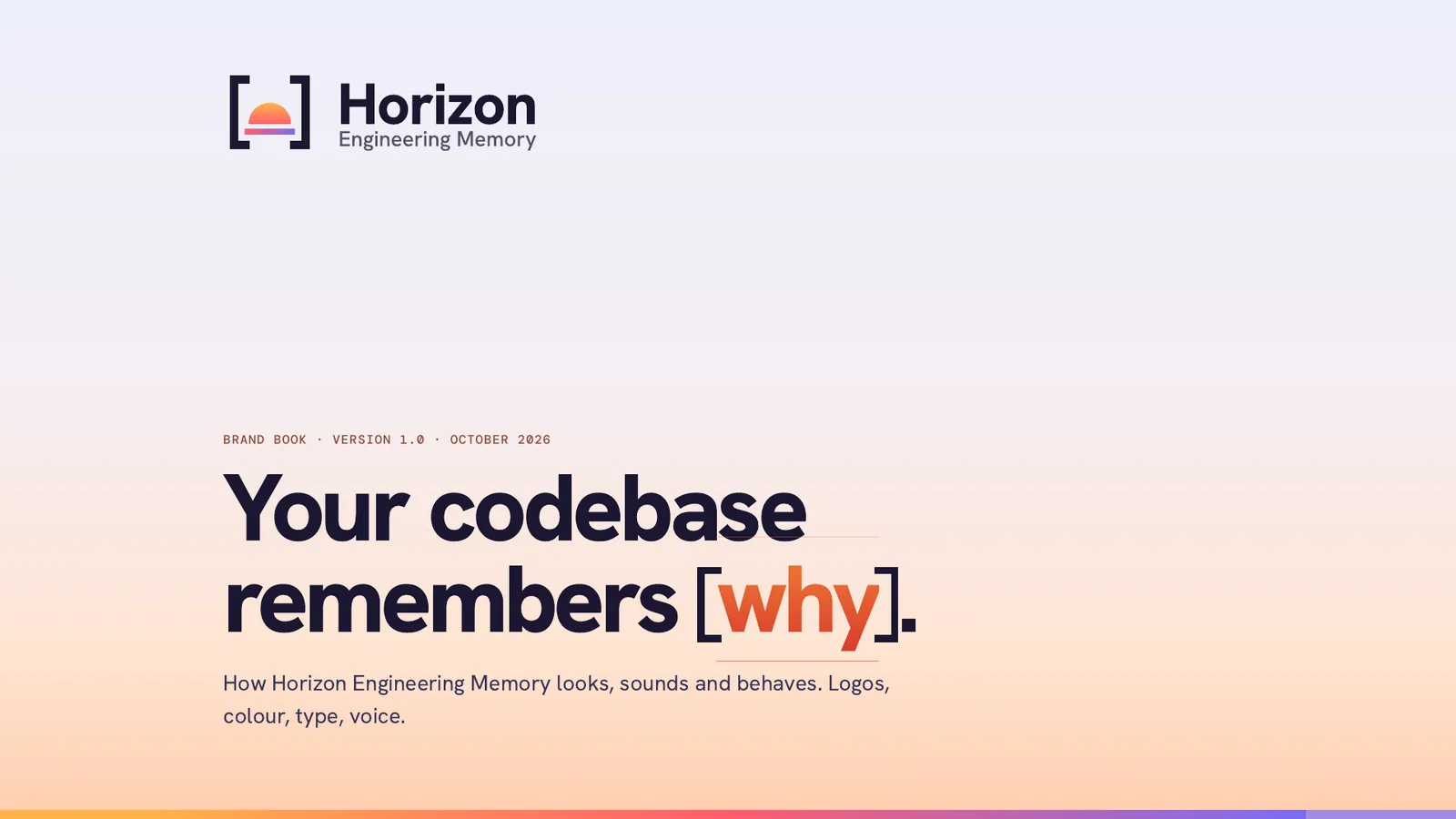
Your codebase remembers why.
Built with
SVG
HTML and CSS
JavaScript
Python
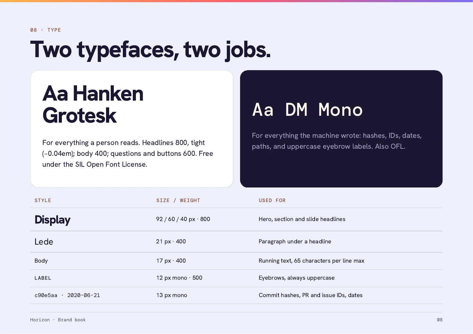
Hanken Grotesk
DM Mono
In short
Problem
A product whose logo was a gradient square
What we did
A new mark, a colour and type system, a voice and an 11-page brand book
Result
A full identity the client could use on day one
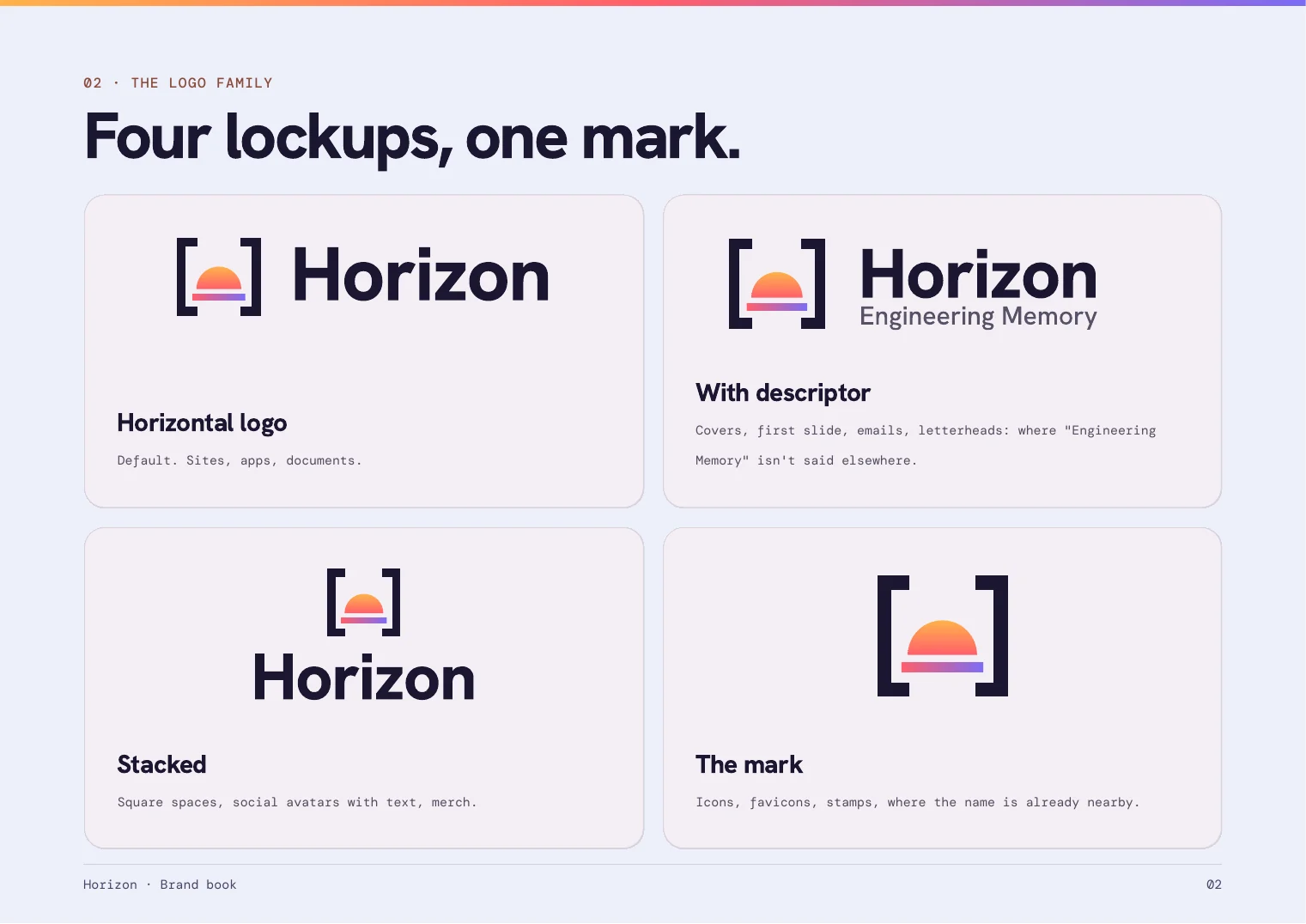
4Logo lockupshorizontal, with descriptor, stacked, mark
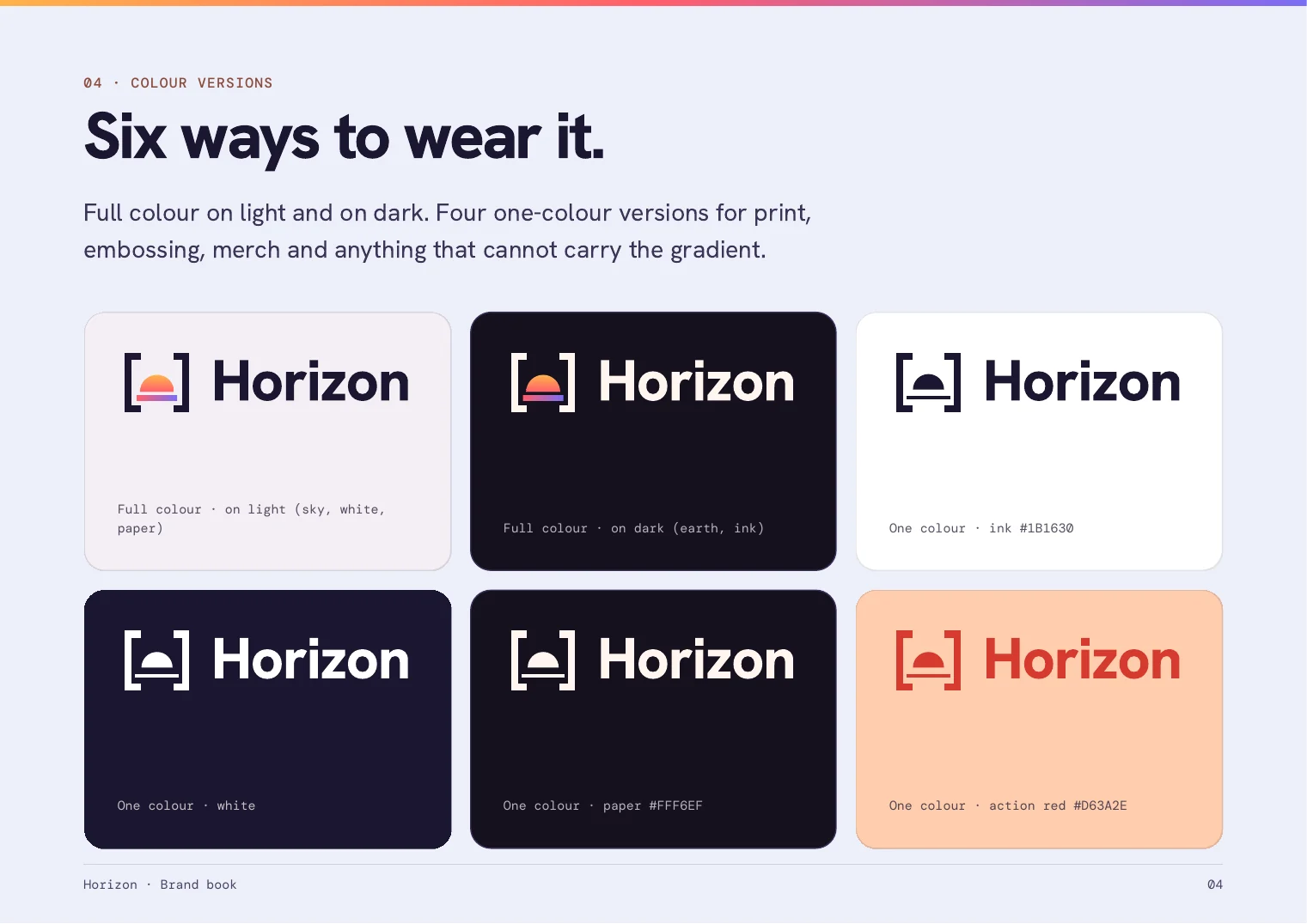
6Colour versionstwo full colour, four one colour
11Brand book pagesA4 landscape PDF
Source: Counts come from the delivered brand package. Hours: Mark's own estimate, 10 to 14 hours.
10 to 14hours of workMark's own estimate
1projectHorizon
Before
The logo was a rounded square with a gradient.
Horizon's pitch deck used a rounded square filled with a gradient as its logo. It was a placeholder: it looks like many AI tools, it disappears at favicon size and it does not work in one colour. The product needed a face of its own.
What I found
The product already had an idea in it.
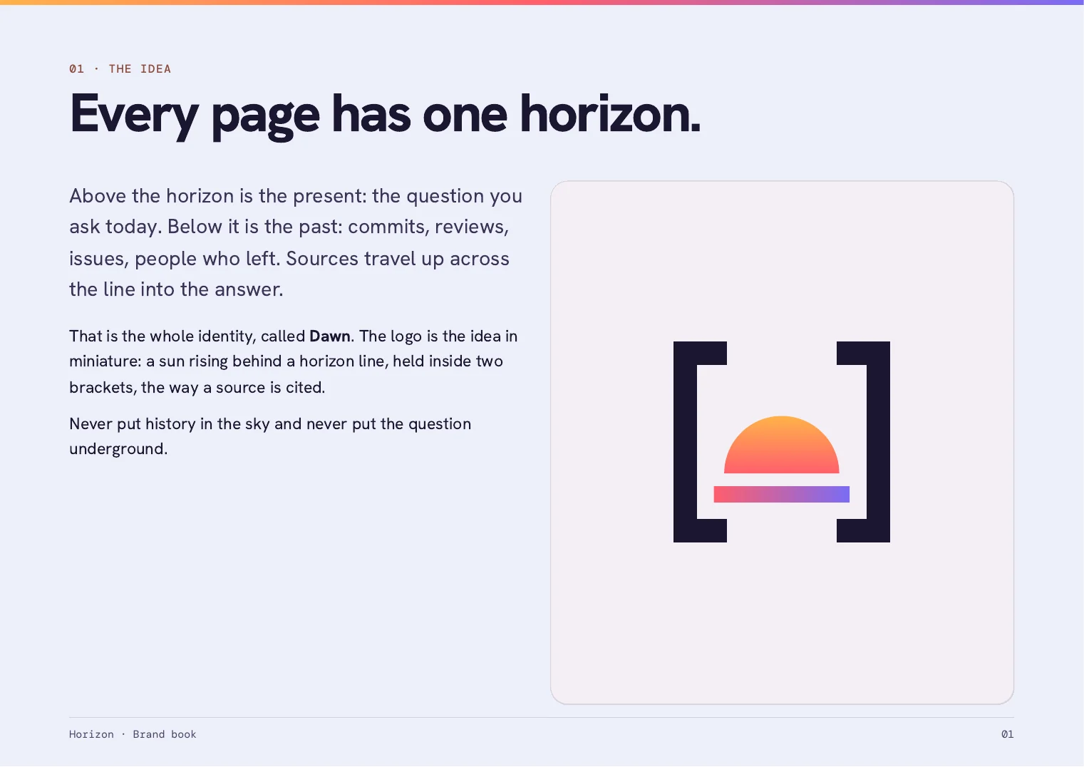
Horizon answers why code is the way it is. The question you ask today sits above a line. The history sits below it: commits, reviews, issues and people who left. That became the whole identity: one horizon on every page.
What I built
One idea, called Dawn
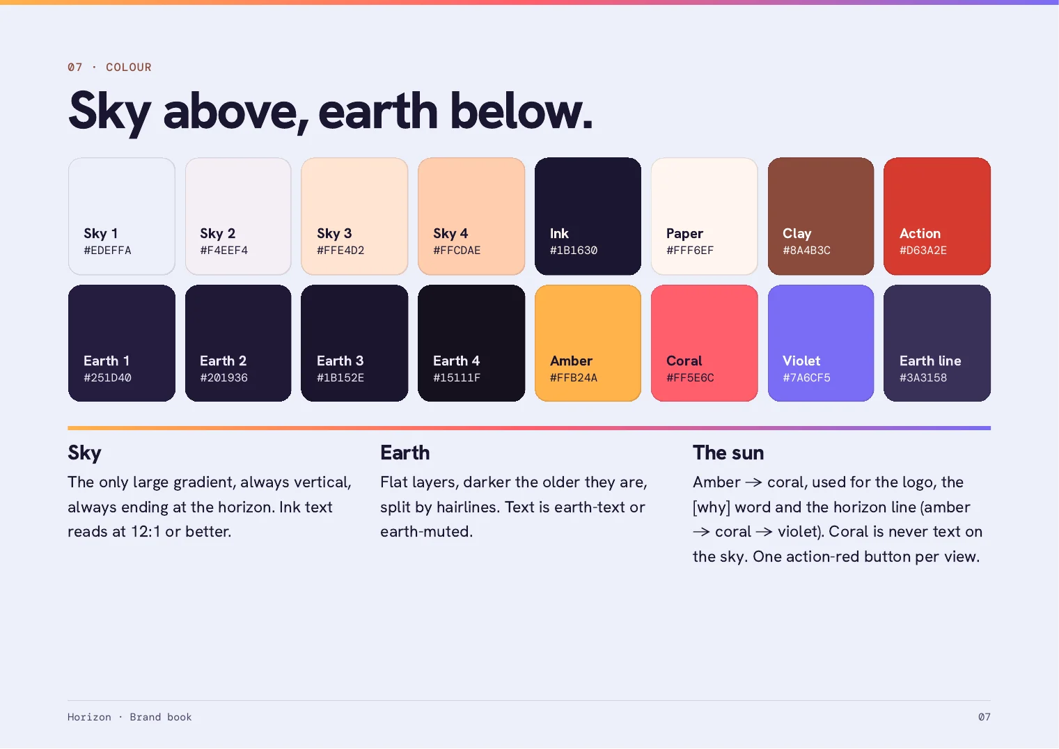
The logo is that idea in miniature: a sun rising behind a horizon line, held inside two brackets, the way a source is cited. Around it we built the full system: four logo lockups in six colour versions, colours that read as sky above and earth below, two typefaces, a plain voice, an icon set, a favicon and app icon, an email signature and the brand book.
Logo in four lockups and six colour versions, as SVG and PNG
Colour, type and voice rules in an 11-page brand book
Icons, favicon, app icon, fonts and an email signature
A product with no identity yet? Let us look.
Free 30-minute call. I look at your site first, then you get a written audit within 48 hours.
What changed
A brand the team can use straight away.
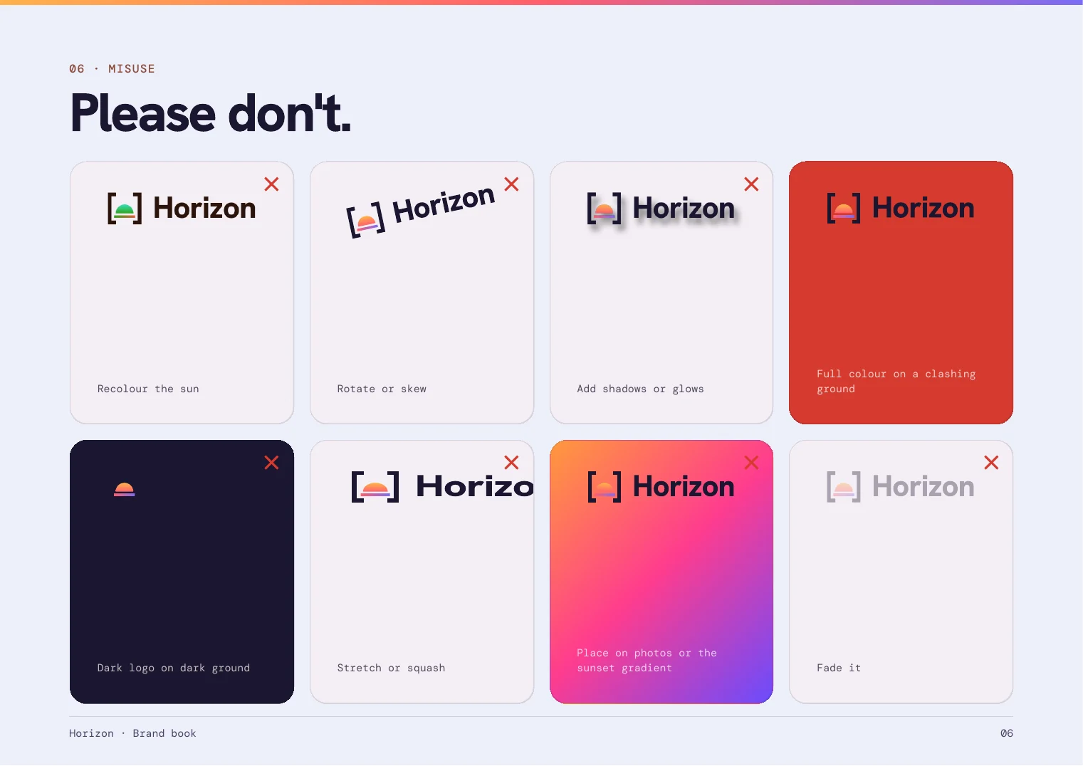
Horizon now has one recognisable mark that works from a favicon to a presentation cover, a colour and type system with clear rules, and a brand book that says what not to do. The same identity runs through the website and through the pitch decks, in English and Romanian.
The identity, page by page
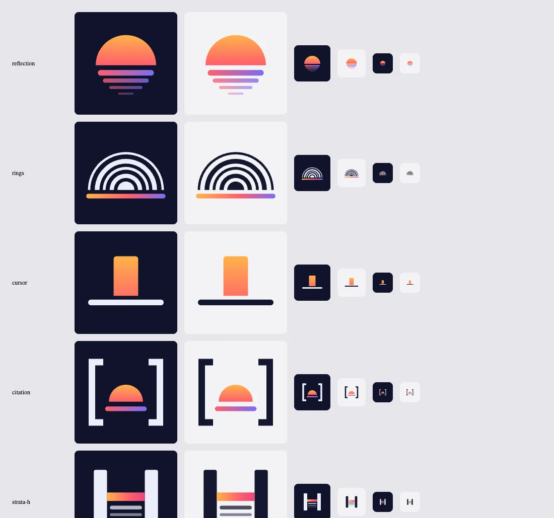
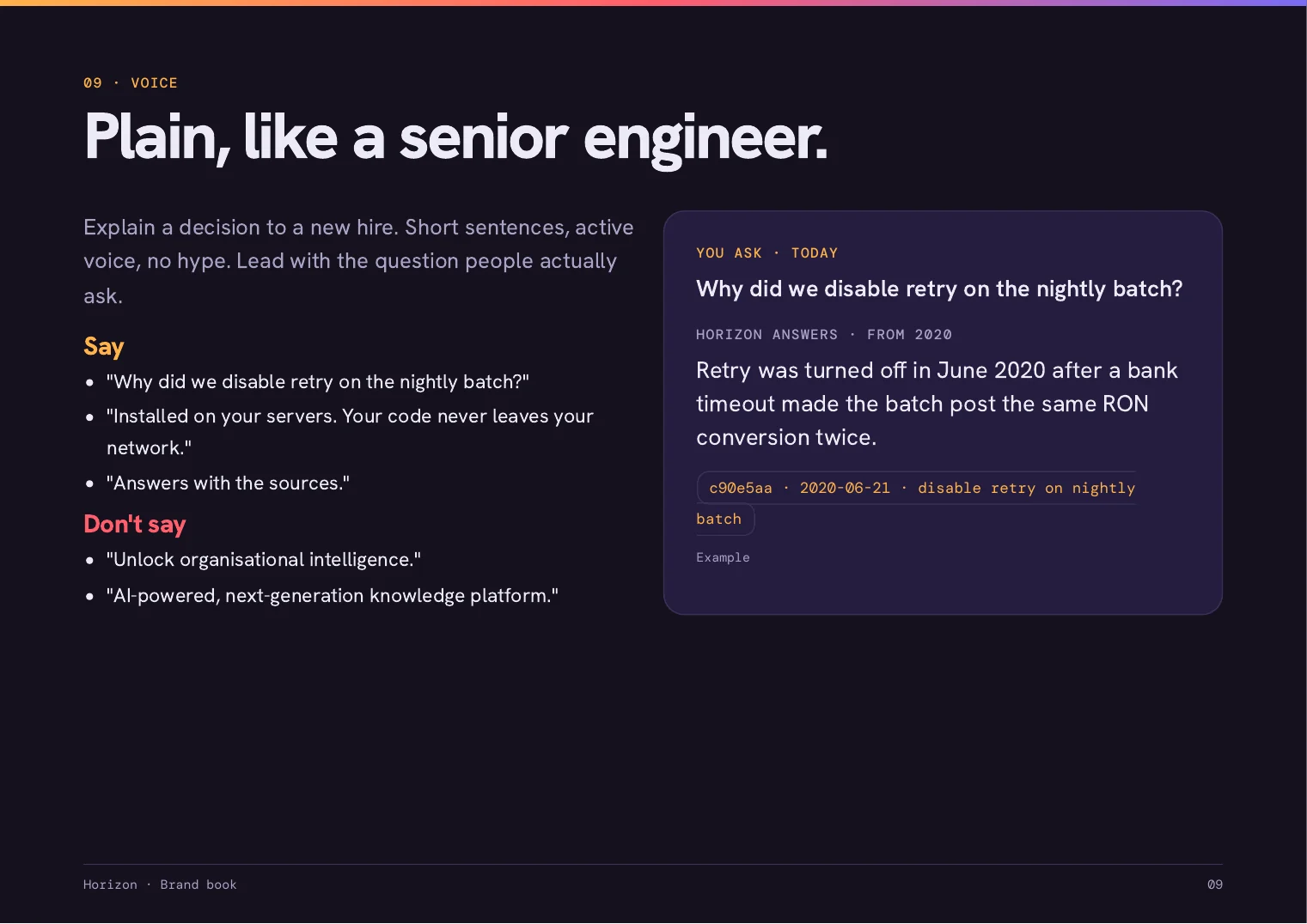
Directions we explored Five mark directions and six typefaces for the wordmark, side by side. The citation mark, brackets around a half sun on a horizon, was chosen.02 The logo family Four lockups, one mark.01 The idea Every page has one horizon. The present sits above it and the history below.04 Colour versions Six ways to wear it, from full colour to one colour for print and embossing.07 Colour Sky above, earth below.08 Type Two typefaces, two jobs: one for what a person reads, one for what the machine wrote.09 Voice Plain, like a senior engineer.06 Misuse What not to do with the logo.
This works if you
You have a product but no identity beyond a placeholder
You want logos, colours and rules you can hand to anyone who builds with them
It is not for you if
You want a logo only, with no system behind it
You cannot give feedback while the directions are narrowed down